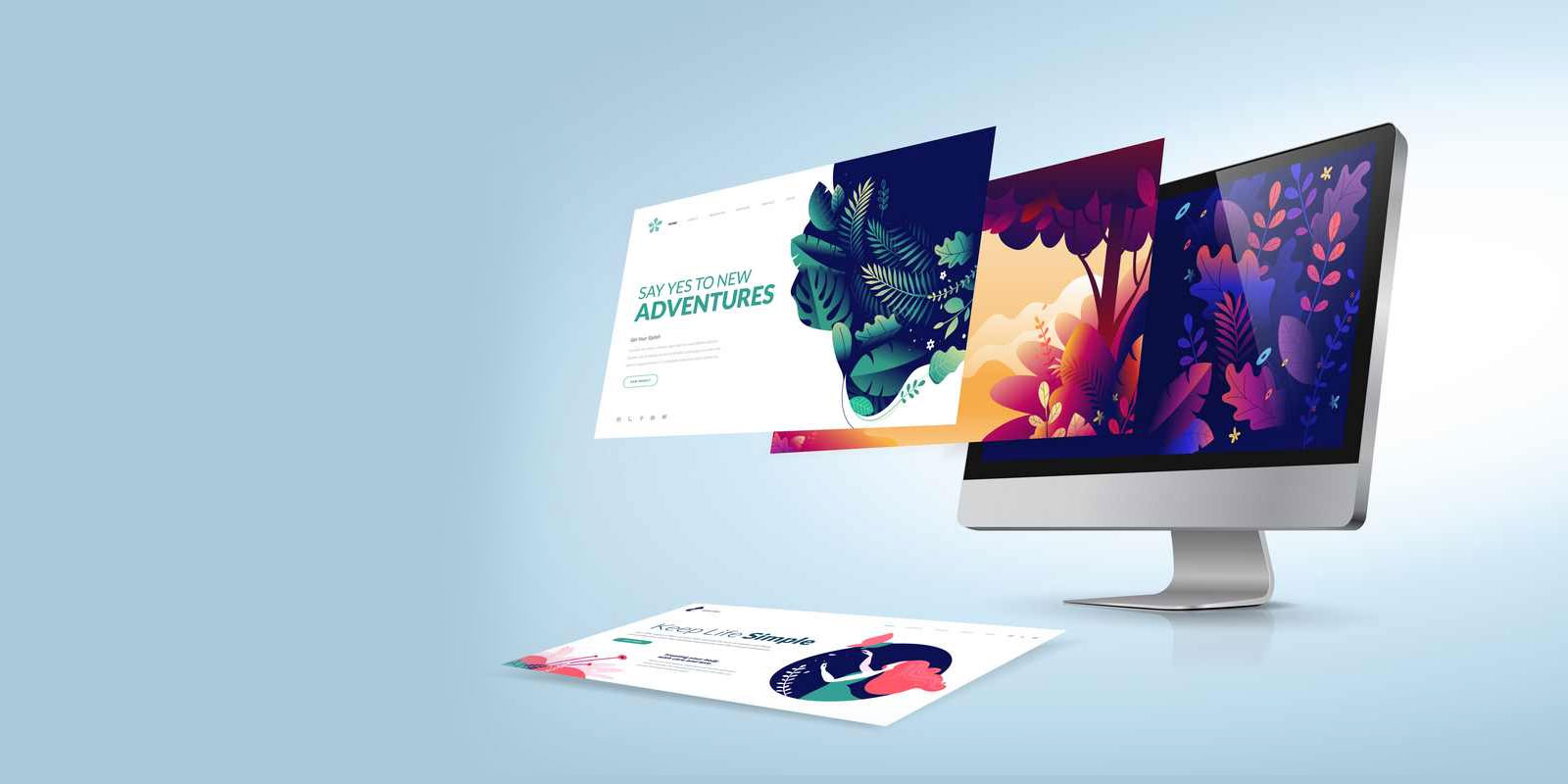
Professional Website Design Company in Delhi for Growing Businesses.
-
Chat With Us
Send Us Mail -
Call Us
Call 24/7 Hours+91 9873320203
-
Visit Office
Professional Website Design Company in Delhi for Growing Businesses.
In today’s digital world, people no longer browse websites only on desktops. Most users now access websites through smartphones, tablets, and mobile devices. Whether someone is searching for a local service, shopping online, or comparing businesses, the first interaction usually happens on mobile.
This shift has completely changed the way websites should be designed.
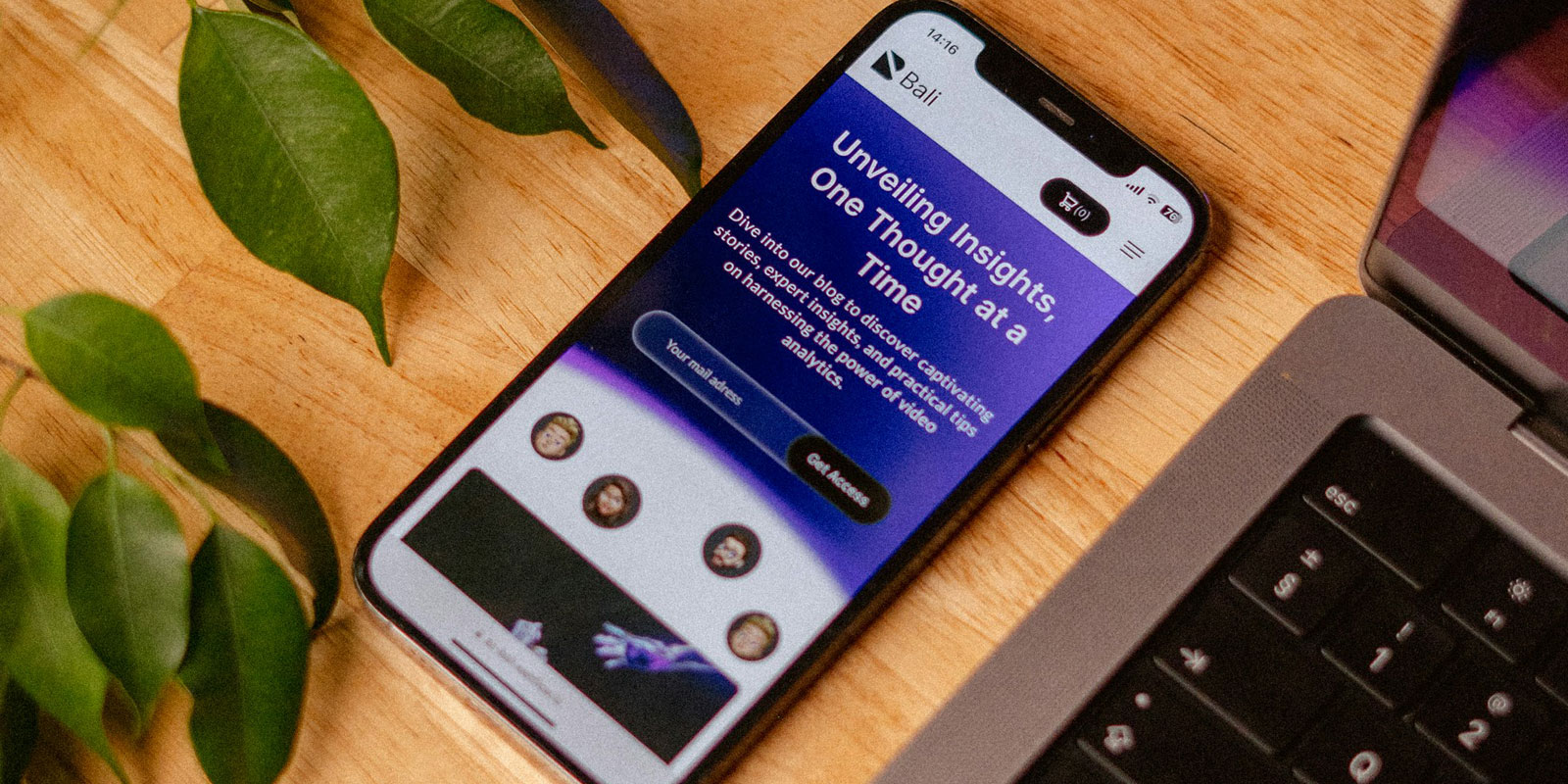
Modern businesses can no longer afford websites that only look good on large screens. A website must now be fast, responsive, user-friendly, and optimized for mobile devices from the very beginning. This is where mobile-first website design becomes essential.
At Veloxa Digital, we believe that successful websites are designed around real user behavior. As a professional agency offering website design in Delhi, we create mobile-first websites that improve user experience, search engine rankings, and business conversions.
If your website is not optimized for mobile users, you are likely losing traffic, leads, and potential customers every single day.
Mobile-first website design means designing the website primarily for mobile devices before adapting it for tablets and desktops.
Instead of shrinking a desktop website to fit smaller screens, the mobile-first approach focuses on creating the best possible experience for smartphone users first.
This includes:
The goal is simple — create a seamless browsing experience regardless of screen size.
Mobile usage continues to grow rapidly across Delhi and India. Customers now expect websites to work perfectly on their phones without delays or layout issues.
If users struggle to navigate your website on mobile, they will leave within seconds.
Businesses investing in website design in Delhi are now prioritizing mobile responsiveness because customer behavior has changed significantly.
Google uses mobile-first indexing, which means it primarily evaluates the mobile version of a website for ranking purposes.
A poorly optimized mobile website can negatively affect:
This makes mobile optimization one of the most important SEO factors today.
At Veloxa Digital, every website we create is designed with SEO and mobile responsiveness in mind to help businesses achieve better online visibility.
User experience directly affects how customers interact with your business online.
A mobile-first website provides:
When users enjoy browsing your website, they are more likely to:
Good website design is not just about appearance — it’s about making every interaction simple and effective.
Website speed is one of the biggest factors affecting both SEO and customer experience.
Mobile-first websites are usually built with:
This helps improve:
Modern users expect websites to load quickly. Even a small delay can reduce conversions significantly.
As a trusted company for website design in Delhi, Veloxa Digital focuses heavily on speed optimization to ensure smooth performance across all devices.
A responsive website automatically adjusts to different screen sizes and devices.
Without responsive design, users may experience:
These issues immediately reduce trust and professionalism.
A mobile-first responsive website creates a premium experience that reflects positively on your brand.
In competitive markets like Delhi, professional presentation plays a major role in customer decision-making.
Ecommerce and online shopping are now heavily mobile-driven.
Customers use smartphones to:
If your ecommerce website is not mobile-friendly, customers will likely abandon the process before completing a purchase.
This is why modern ecommerce website design in Delhi now focuses heavily on:
At Veloxa Digital, we create ecommerce websites optimized for mobile conversions and seamless user journeys.
A professionally designed mobile-first website includes several important elements.
Websites automatically adjust according to screen size and resolution.
Optimized performance for smooth mobile browsing.
Buttons and menus designed for easy mobile interaction.
Minimal and organized layouts for better readability.
Compressed visuals without reducing quality.
Technical optimization for better Google rankings.
Clear call-to-actions and easy inquiry forms.
Search engines prioritize websites that provide excellent mobile experiences.
A mobile-optimized website helps improve:
Google rewards websites that deliver strong usability across devices.
This is why businesses looking for website design in Delhi are now investing in responsive and SEO-focused web solutions.
Delhi has one of the fastest-growing digital markets in India. Customers frequently search for:
Most of these searches happen on mobile devices.
A business without a mobile-friendly website risks losing customers to competitors with better online experiences.
Whether you run a startup, agency, ecommerce store, or local business, mobile optimization is now a necessity rather than an option.
At Veloxa Digital, we create modern websites designed for:
We combine strategy, UI/UX design, and technical expertise to create websites that perform exceptionally across all devices.
Our websites are:
Whether you need a business website, ecommerce platform, or custom web solution, our team focuses on creating experiences that help businesses grow online.
Mobile-first website design is no longer a trend — it has become the standard for modern digital experiences.
As mobile usage continues to dominate online browsing, businesses must prioritize responsive design, fast performance, and user-friendly interfaces.
A professionally designed mobile-first website can:
If you are looking for modern and professional website design in Delhi, Veloxa Digital can help you create a website that delivers both performance and visual excellence.
Your website should not only look good — it should work perfectly for every user, on every device.